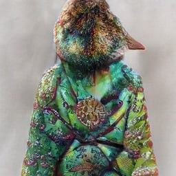
The MSPaint colouring in at the bottom so they had space to write real words is just perfect
nope, still not going to pay an artist
They didn’t even know how to use the color picker tool
“Hey, wanna go to parkiquaver?”
“What?”
“Parkiquaver, the gay club with the penis in the logo, instead of an i.”I swear I just go there for the swper
RESRT
SWPER
Did they really just paint over with a totally wrong color to put their slogan on it? How fricking lazy can you be?!
Since they’re using slop in the first place, I’d say unimaginably lazy
It’s called irony, brah
What’s ironic?
Seeing the Waze logo next to Facebook and Instagram is a bit odd too.
they’ve been doing reviews for a while, just no one cares
I thought that was a dildo lmao
Is it not?
Everything’s a dildo if you’re brave enough.
looks at your car
… I’ll give you $20 if you do it
all the best foods are shaped like dicks
I mean…
Judging by the faded colours, they probably cheaped out on the print as well.
My brain hurts.
Ok, but that design could be an idea for a company named “Parking 95” where the G is a 9 in the same font. Just imagine Parkin95 with the 95 in red and slightly bigger than the other text.
Yes it’s slop, but it’s not a bad idea for an artist to take inspiration from.
I’m not sure the ‘I’ dildo is such a good idea.
Of course not, but that’s not what I’m saying.
I don’t think you’re saying much
🤔
I don’t get it.
They put Ai slop on the light box to advertise their place.
how do you know?
nonsense words, inconsistent font shading, kindergarten level MSpaint edit for the important text, overall garish look and lack of theming in the details.
interesting, thanks for answering, not sure why people were downvoting my question
Most people are irrational about AI right now, and not for the right reasons.
It’ll be the end of the human race but not paying artists has zero to do with that outcome
You can tell by the way it is.


